Simon Wilson: Exploring Python: Stack Overflow Dev Days Amsterdam November 2009
FlowingData: How to Make a US Country Thematic Map Using Free Tools

The New York Observer: In the Battle Between Facebook and MySpace, A Digital ‘White Flight’
FlowingData: Rise of the Data Scientist
Coding Horror: Code: It’s Trivial
Zero Intelligence Agents: How to: Use Python and Social Network Analysis to Find New Twitter Friends
While gearing up on a content management project, a few developers were wrangling with how to share solution diagrams between Visio and OmniGraffle. While there is a level of compatibility between the two, its not ideal. While researching, I went off into a related tangent, a cross platform tool that I can manipulate from a text editor or programming language, and ended up reading about Graphviz.
Graphviz – command line tool and DSL (dot) to define and render graphs and diagrams.
Doesn’t sounds like much, but check out this magic: Visualizing traceroute output with Ruby and Graphviz or how about Maven based dependency graphing?
I think prefuse (with the unbelievable looking flare) is an excellent related toolkit to look into next (interaction and animations!!!!!) .
O’Reilly: An Introduction to GraphViz and dot
O’Reilly: Graphviz – Why draw when you can code?
Orgmode.org: org-exp-blocks.el: pre-process blocks in org-mode files in Emacs to generate diagrams – rocking!
Bernt Hansen’s fantastic Org Mode – Organize Your Life In Plain Text! is a working example of the above org-mode use case (and a great org-mode tutorial)
Forever for Now: UML Diagrams Using Graphviz Dot
Haven’t read or experimented with yet, but will…
Linux.com: Create relationship diagrams with Graphviz
IBM developerWorks: Visualize function calls with Graphviz
Graphviz Resources – large list of viewers, navigators, language bindings, etc
WikiViz: A large list of related tools and libraries
ZGRViewer: a Java-based desktop GraphViz/DOT Viewer – Adds interactivity to viewing a dot defined graph.

Thought provoking, conversation starting, and probably controversial counting upon who you are, check out the whole single page comic.
USAToday: The 35 counties where the foreclosure crisis started.
Ever hear of Glass-Steagall? Well, maybe if we did, or understood its implications more widely when it was repealed in 1999, according to Boing Boing this crisis may have been averted.
The Crisis of Credit Visualized – an infographic movie!
Good: Making Sense of the Financial Mess – more interesting infographics.
PBS: The Ascent of Money – a fantastic movie that puts the management and meaning of money into context, to better understand the crisis.
Frontline: Inside the Meltdown – what was happening during the stock crash and aftermath? What where some of the policies that led up to it.
Frontline: Ten Trillian and Counting – on some of the fundamental issues the lie underneath the financial crisis.
Baseline Scenario: Financial Crisis for Beginners.
Jon Stewart’s confrontation with Jim Cramer.
The NYTimes uses Flash to produce analysis of each match-up in the NFL playoffs and a fun game to predict winners.
Here is one example of upcoming game analysis: Inside the Playbook: Philadelphia at Minnesota
Here is the predict the winner game: Inside the Playbook Challenge
And go Eagles!
I expected this to be bigger news in my circles, but it hasn’t registered. CNN has rejected the news crawl for a far less busy headline flip in its news broadcasts. The new UI makes it far easier to absorb the news broadcast without constant distraction and sometimes even helps to clarify whatever it is that is being reported. Great job CNN.
NYTimes: The Flipper Challenges the Crawl
Data visualizations can sometimes spur us into contemplative directions. Sometimes they can put us to sleep. These are some of the more interesting election visualizations I’ve come across:
Mark Newman, Department of Physics and Center for the Study of Complex Systems, University of Michigan: Election Maps
Robert J. Vanderbei, Professor and Chair, Operations Research and Financial Engineering, Princeton: Purple America
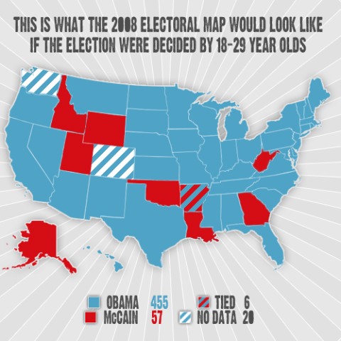
What the electoral map would look like if decided by 18-29 year olds
NYTimes: Election Results 2008
Interesting Analysis
David Kuhn: Politico: That huge voter turnout? Didn’t happen: “Between 60.7 percent and 61.7 percent of the 208.3 million eligible voters cast ballots this year, compared with 60.6 percent of those eligible in 2004”
Andrew Sullivan: He Saw It Coming: McCain/Palin ran a post-modern campaign (unlike Sullivan, I think it almost worked).
CNN: Number of votes cast set record, but voter turnout percentage didn’t
Associated Press: No hidden white bias seen in presidential race
CSMonitor: Obama made inroads with religious vote
NYTimes: This American Moment – The Surprises: Guess who Joe the Plumber voted for?
Salon.com: How Obama won, by the numbers: “The 18-to-29-year-old cohort supported Obama by a 2-to-1 margin (66-32), and while it is too soon to gauge precise turnout measures, their numbers clearly grew.”
Salon.com: Obama and the dawn of the Fourth Republic
NYTimes: Dissecting the Changing Electorate
Vote swings in rich and poor countries
Red State, Blue State, Rich State, Poor State: Election 2008: what really happened
Interesting Tools:
A Beautiful WWW: 20 Useful Visualization Libraries
physorg.com: Visualizing election polls
IBM’s Many Eyes
O’Reilly: Glenn Letham: Hackers Tap Into the Functionality and Simplicity of Google Maps.
Many fun things to try here.